

Loco - Eco-friendly Grocer
Branding Design
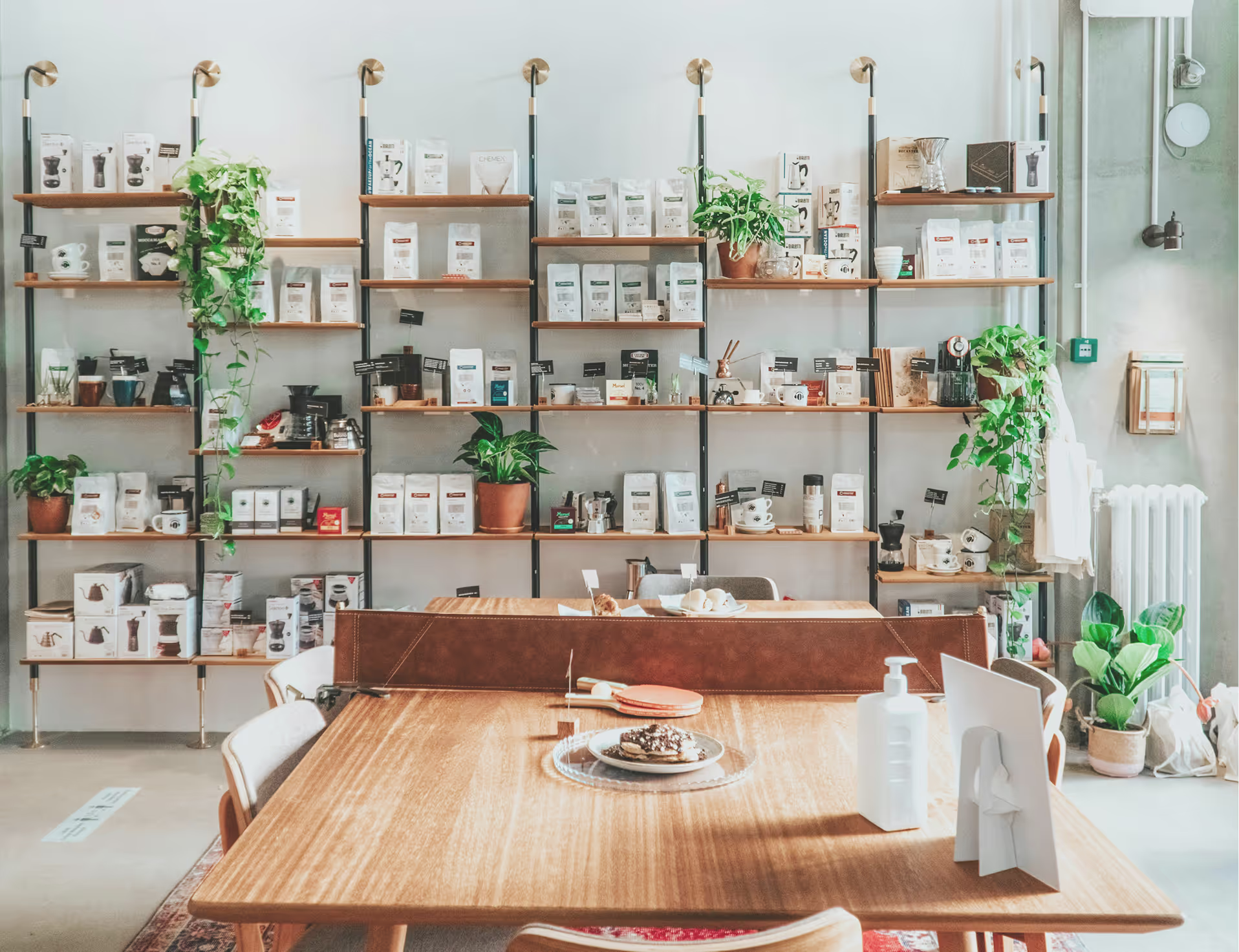
A Brand Rooted in Community and a Sustainable Vison
Loco is a Montreal-based grocery store whose mission is to reduce packaging waste by providing reusable containers and jars through bulk dispensing. Their goal is to change the shoppers’ habits by positioning itself as an educational space, conscious consumption and food literacy.
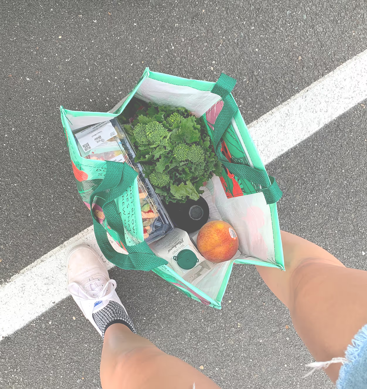
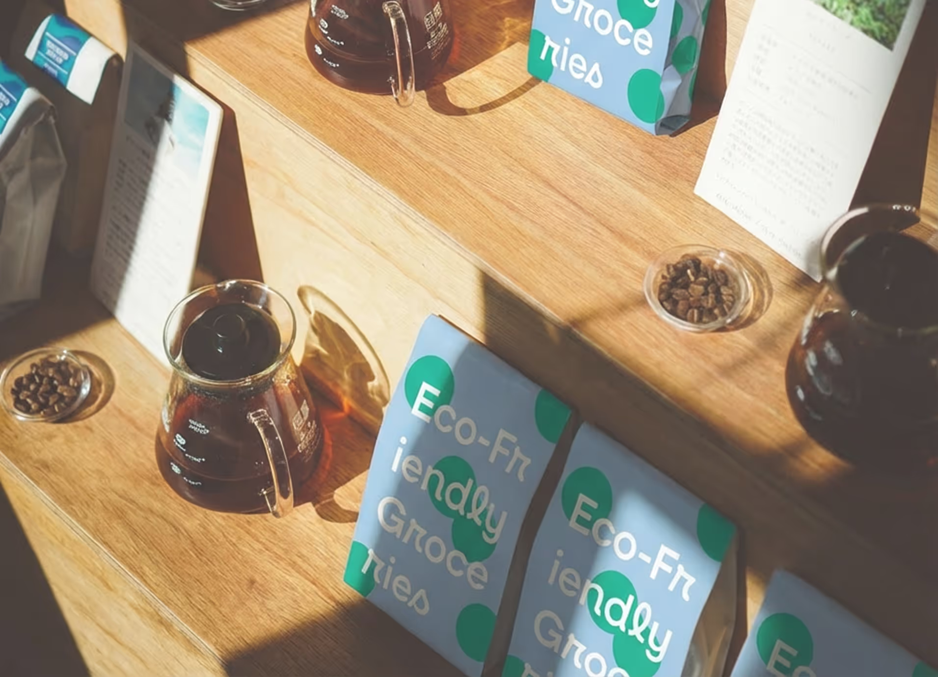
For conscious consumers and locals
The issue is the lack of recognizable branding and visibility; it is low and needs to bring more attention to all target audiences. The audience includes young adults, students, families, conscious consumers, and local residents. The brand must come across as approachable, friendly and authentic to their mission.
Reusability that lasts forever
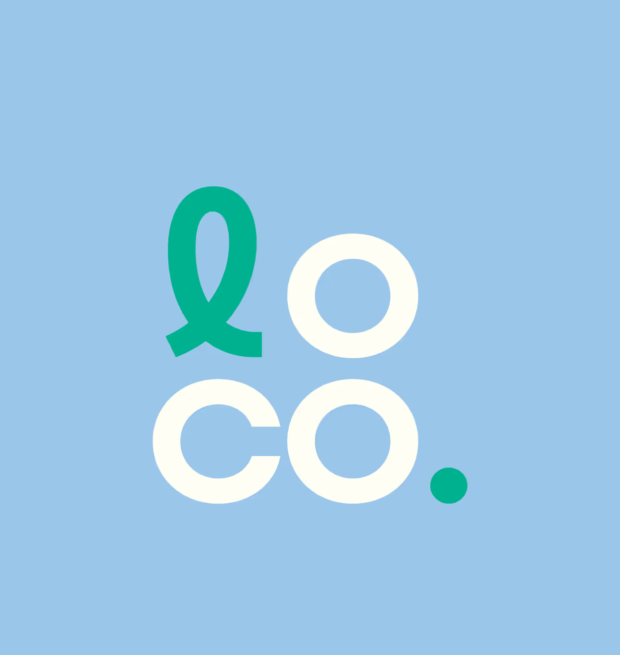
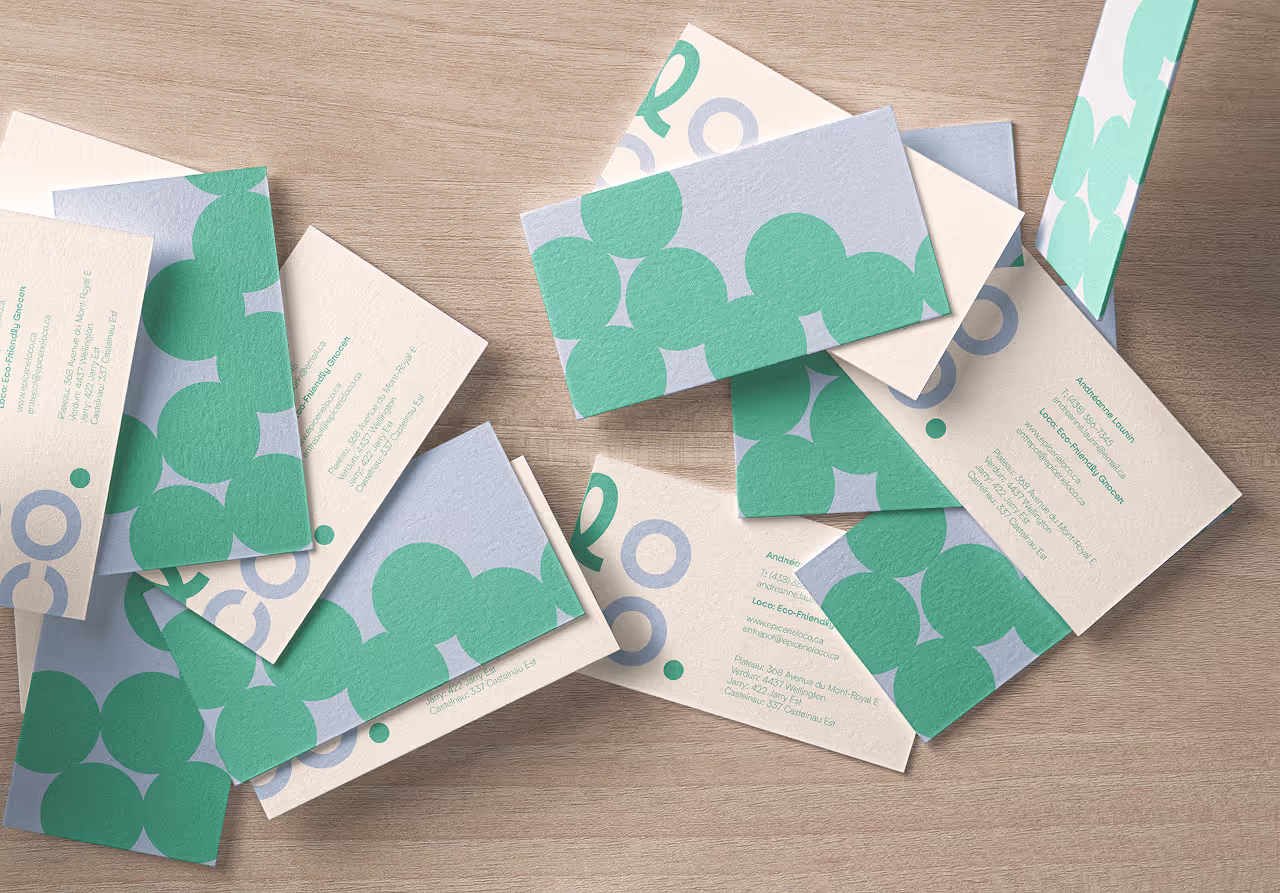
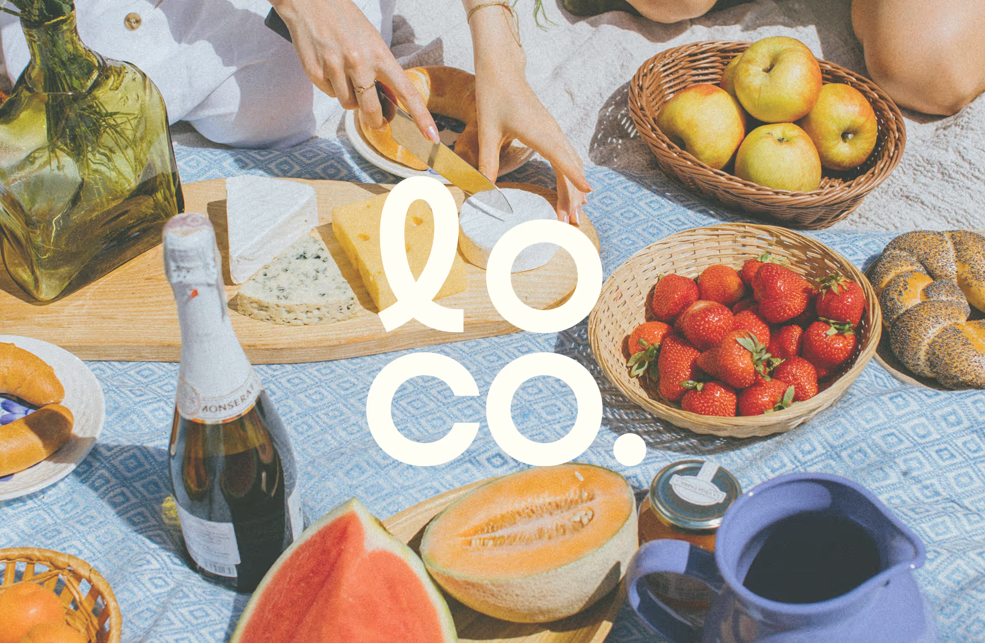
By separating the Lo and Co and positioning them on top of each other, the meaning of Loco is reframed from any alternative definition and tied to the idea of a local company. I further expressed this through a period, emphasizing the store’s strong mission with confidence and reliability. The choice of refraining from the typical colours of a sustainable grocery store, such as the colour green, stands its ground as a brand of importance, while feeling approachable and fun for younger target audiences.
